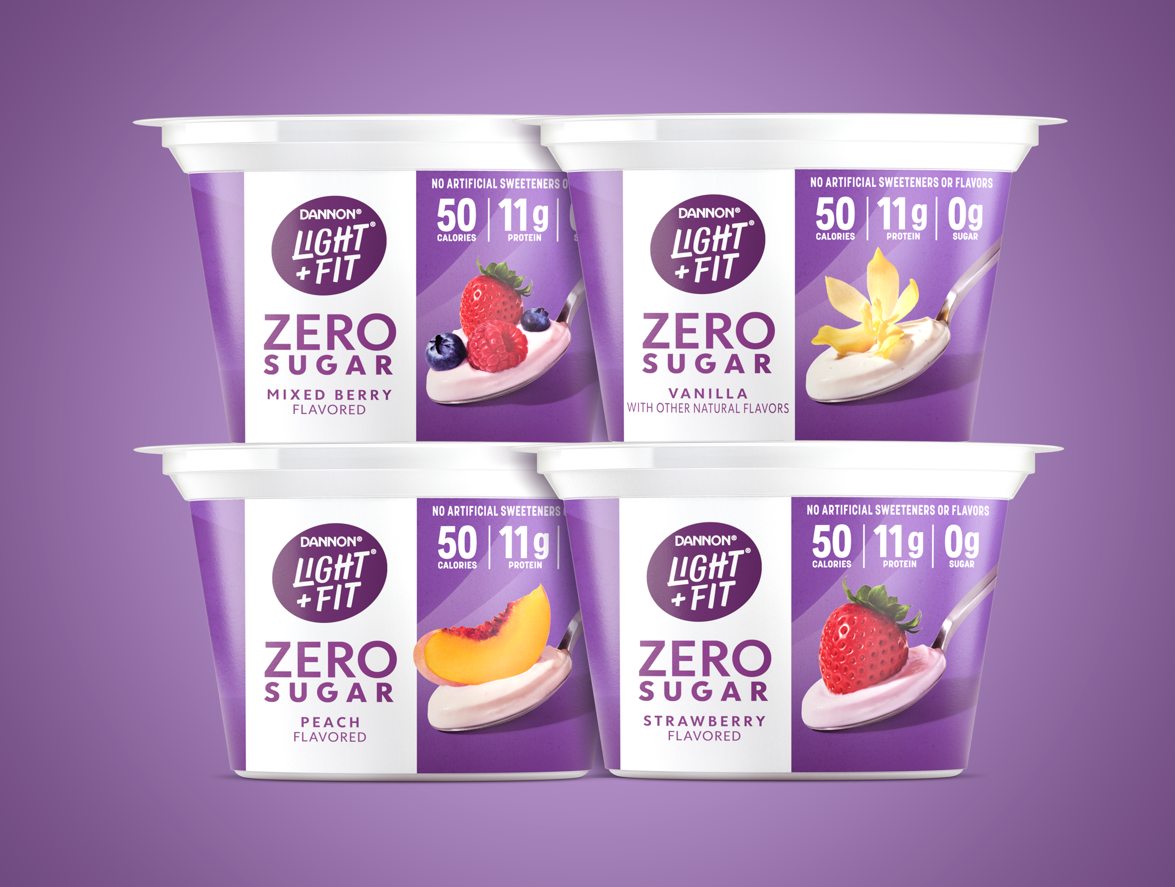
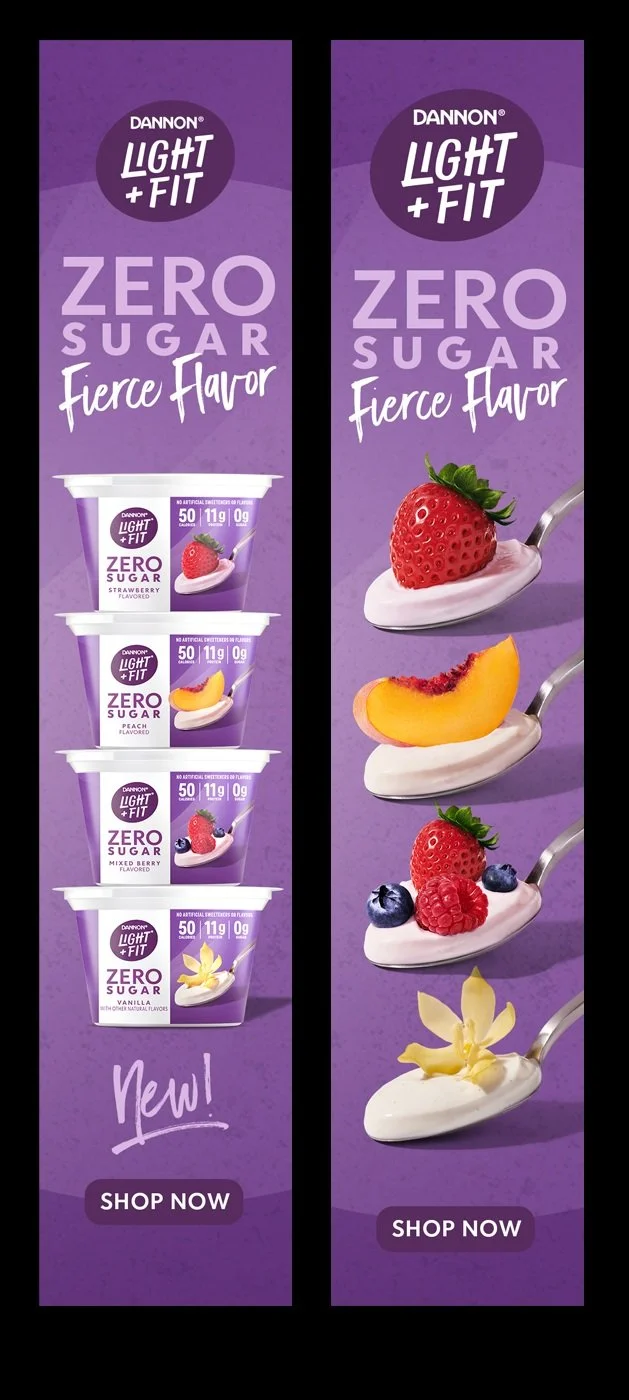
Light + Fit Zero
Challange: In order to continue to remain competitive at shelf Light + Fit was launching a new line of zero sugar yogurts. The new line had to signal to it’s core base that it was part of the L+F family while at the same time pique the interest of a younger demographic interested in zero sugar products. Signaling taste appeal was also crucial.
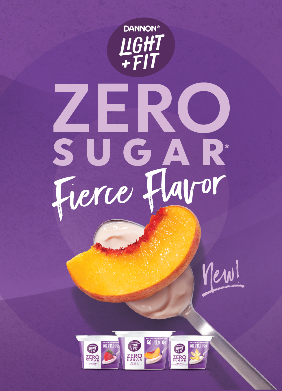
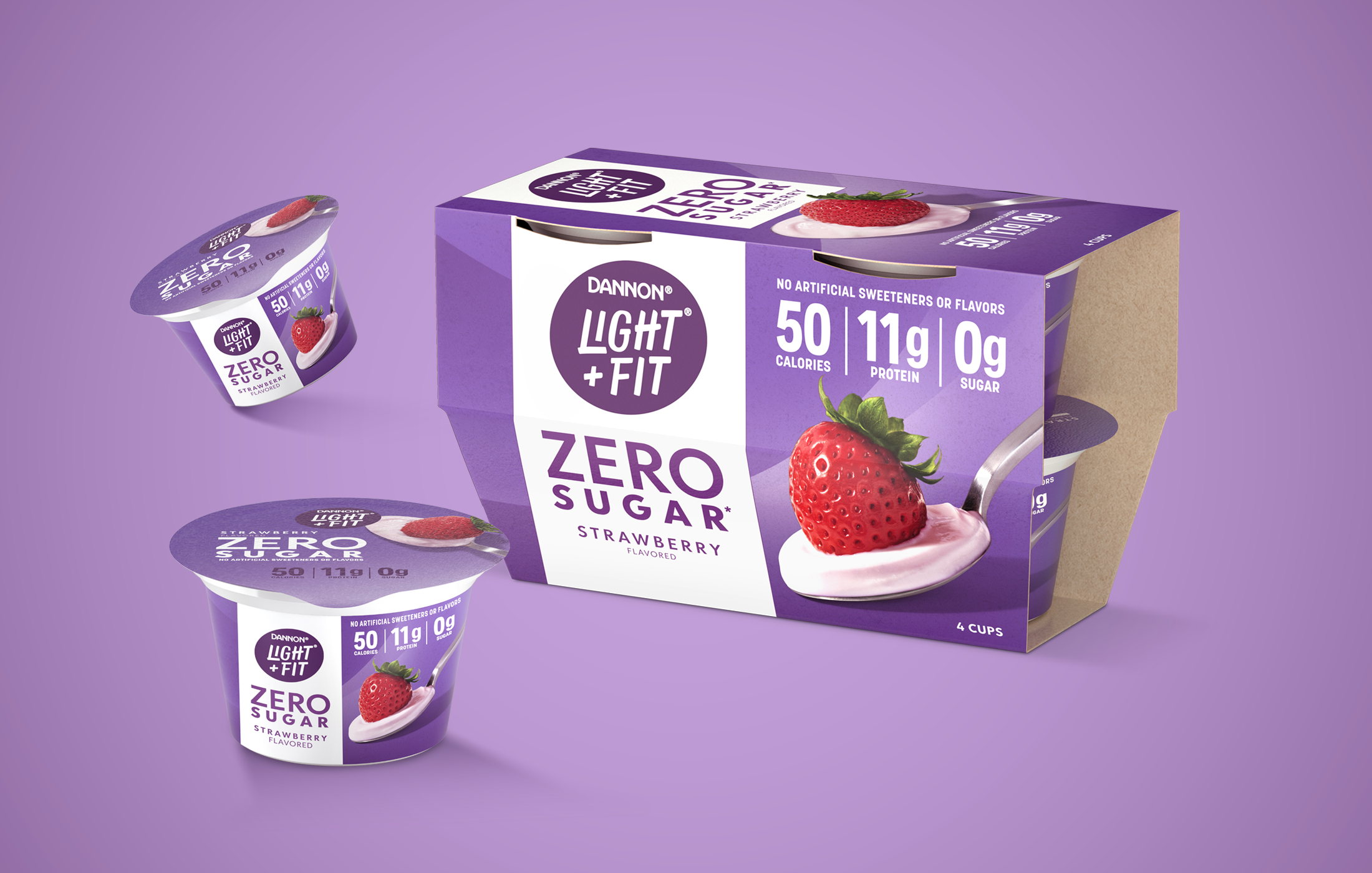
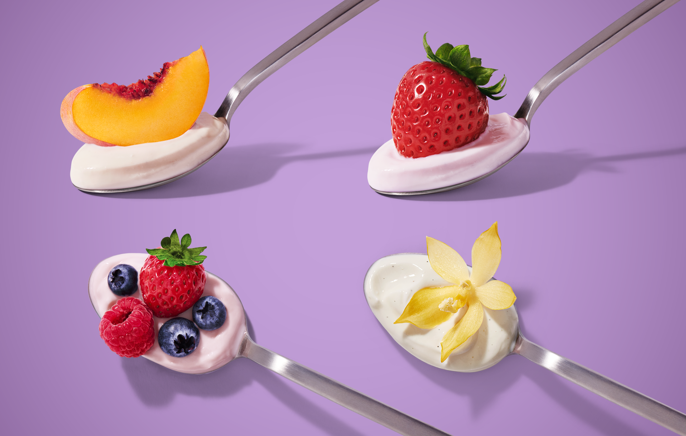
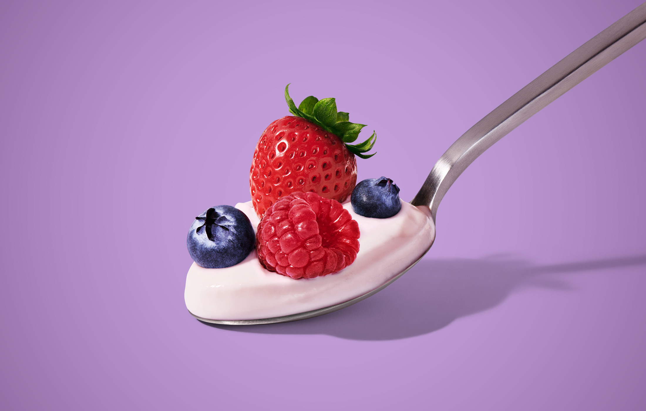
The result: Balancing the distinct brand assets with new category cues was key to the final result, white was a signifier of zero sugar at shelf so the final design carefully straddled the robust purple world of L+F and the minimalism of zero sugar products. Delicious flavor cues on billowy dollops of yogurt worked delicious wonders against the amethyst backdrops, just enough to satisfy a craving.
My role: After leading the exploratory and initial design phase with our partner agency, we moved it in-house to finish the final rounds with our brand partners. I led the photography development pre and post, saw the project through to production and worked with two designers to develop all the assets for shopper, digital and e-comm, including the toolkit.
Creative Direction
•
Art Direction
•
Design
•
Packaging Design
•
Product Launch
•
Creative Direction • Art Direction • Design • Packaging Design • Product Launch •


Credits
Design Strategy: Lauren Koprowski
Sr. Brand Design Manager: Jane Sayer
Creative Design Lead: Amanda Villalobos
The packaging design was a collaboration with Beardwood & CO
Designers: Amanda Villalobos, Rick Painter, David San Miguel
Writer: Erin Bosik
Photography: Julia Stotz, via the incredible team at Apostrophe Reps.