Eat like no one
is watching.
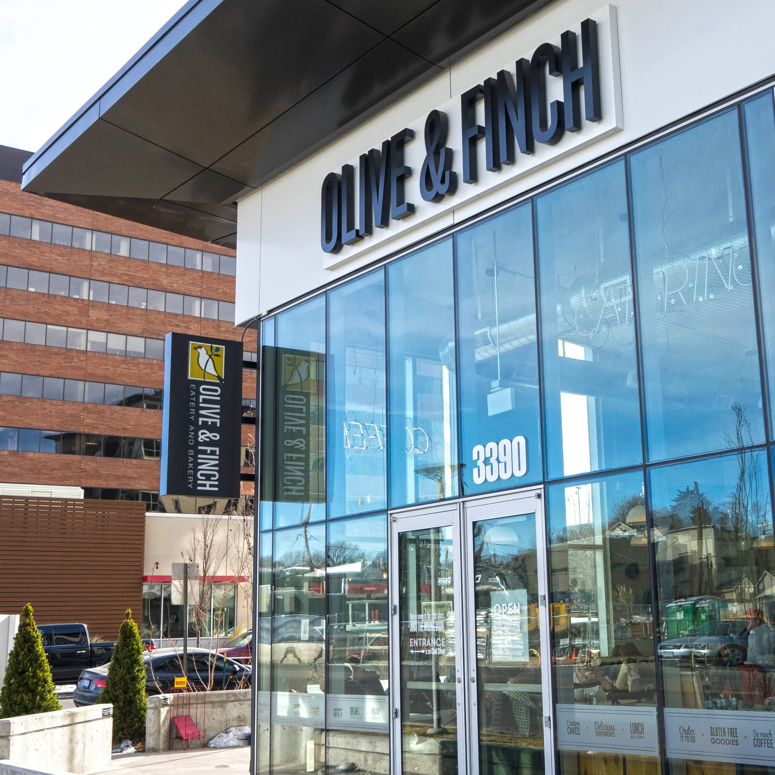
Olive & Finch brings fresh ingredients, scratch-made staples and fresh baked goods to Denver foodies. When talks of the second location began, it became apparent that the brand needed an overhaul. With much collaboration from chef/owner Mary we talked about her hard earned lessons, discussed her vision for the future, researched the competitive landscape and got to work. The biggest challenge was creating an identity that spoke to the superior quality of the food–and in turn higher price point, served in a fast-casual setting.
•
Branding
•
Web
•
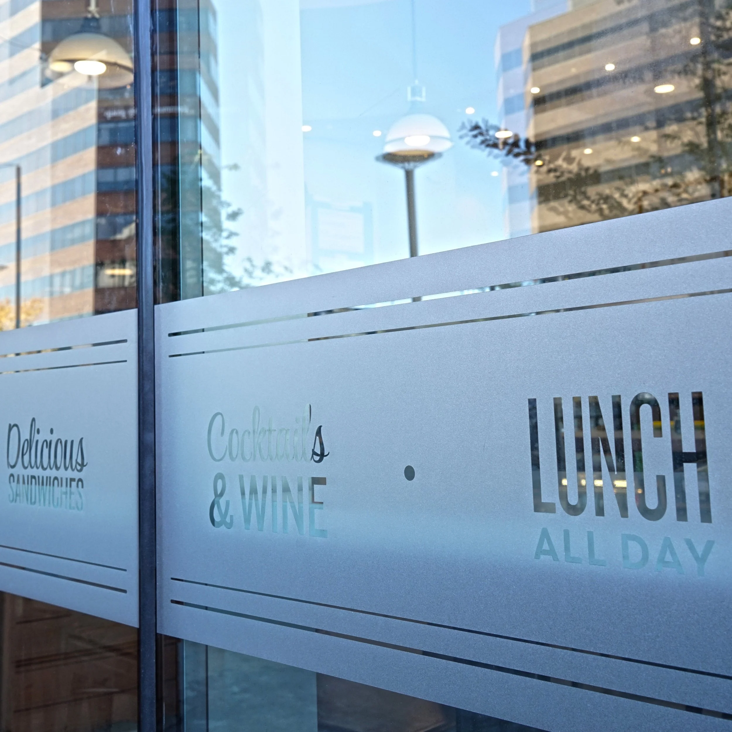
Signage
•
Illustration
•
Graphic Design
•
Art Direction
•
Creative Direction
• Branding • Web • Signage • Illustration • Graphic Design • Art Direction • Creative Direction
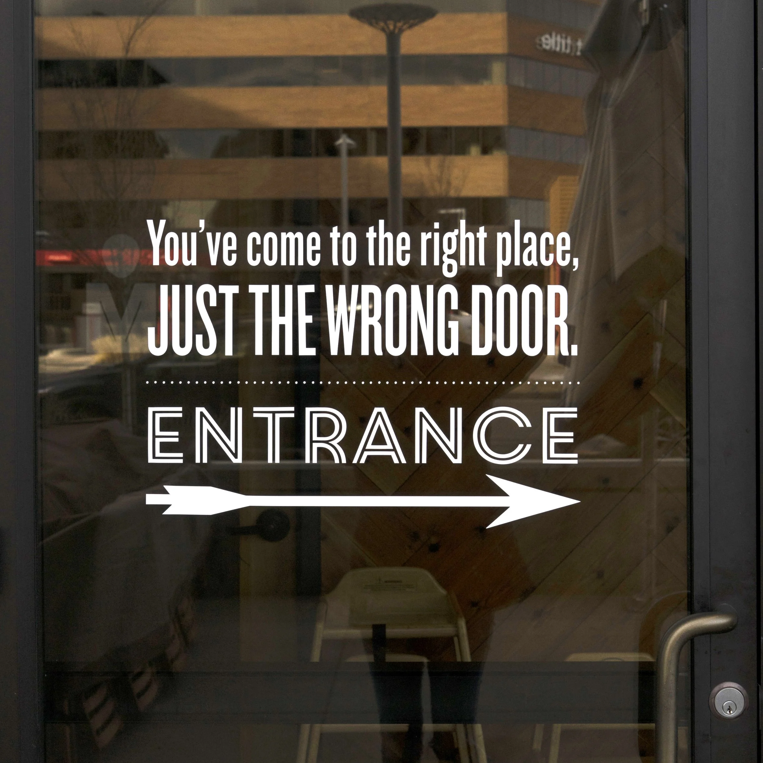
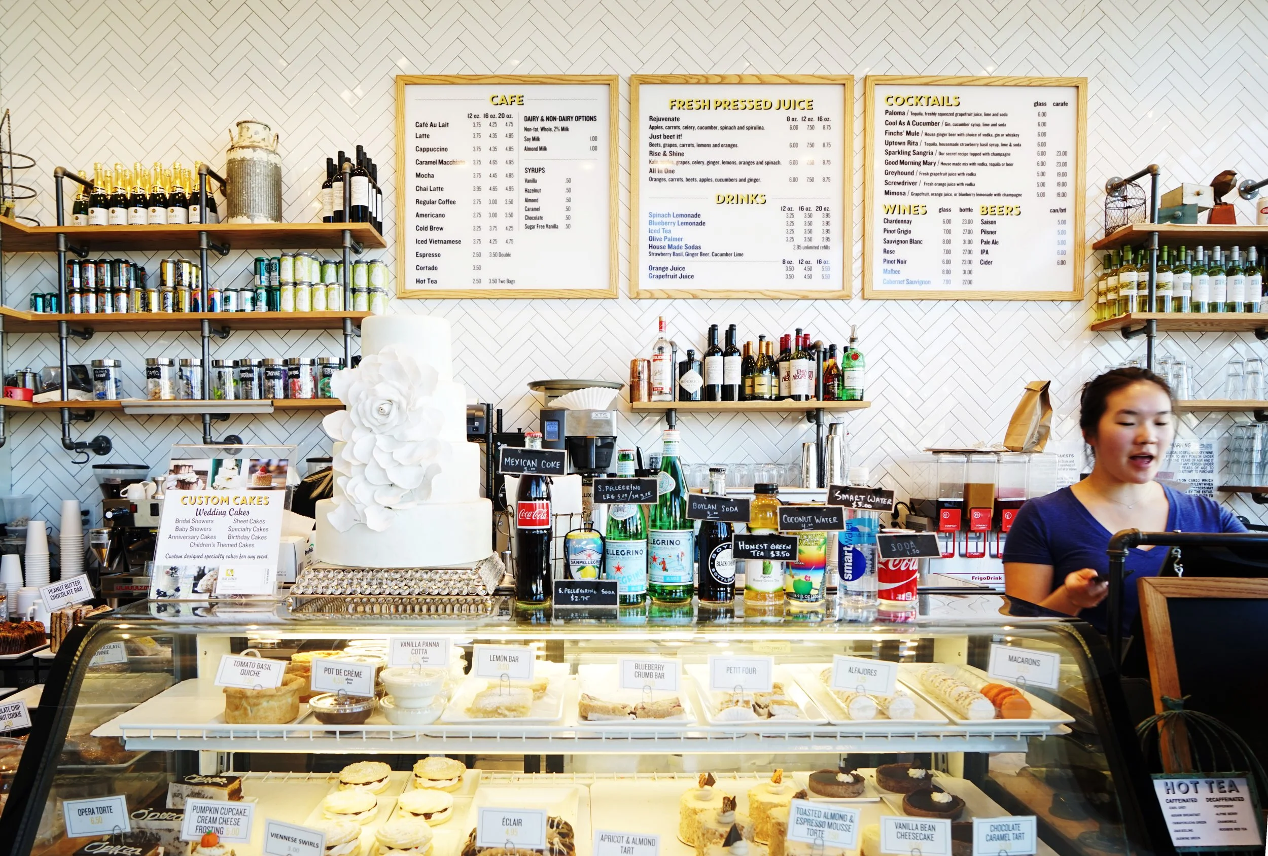
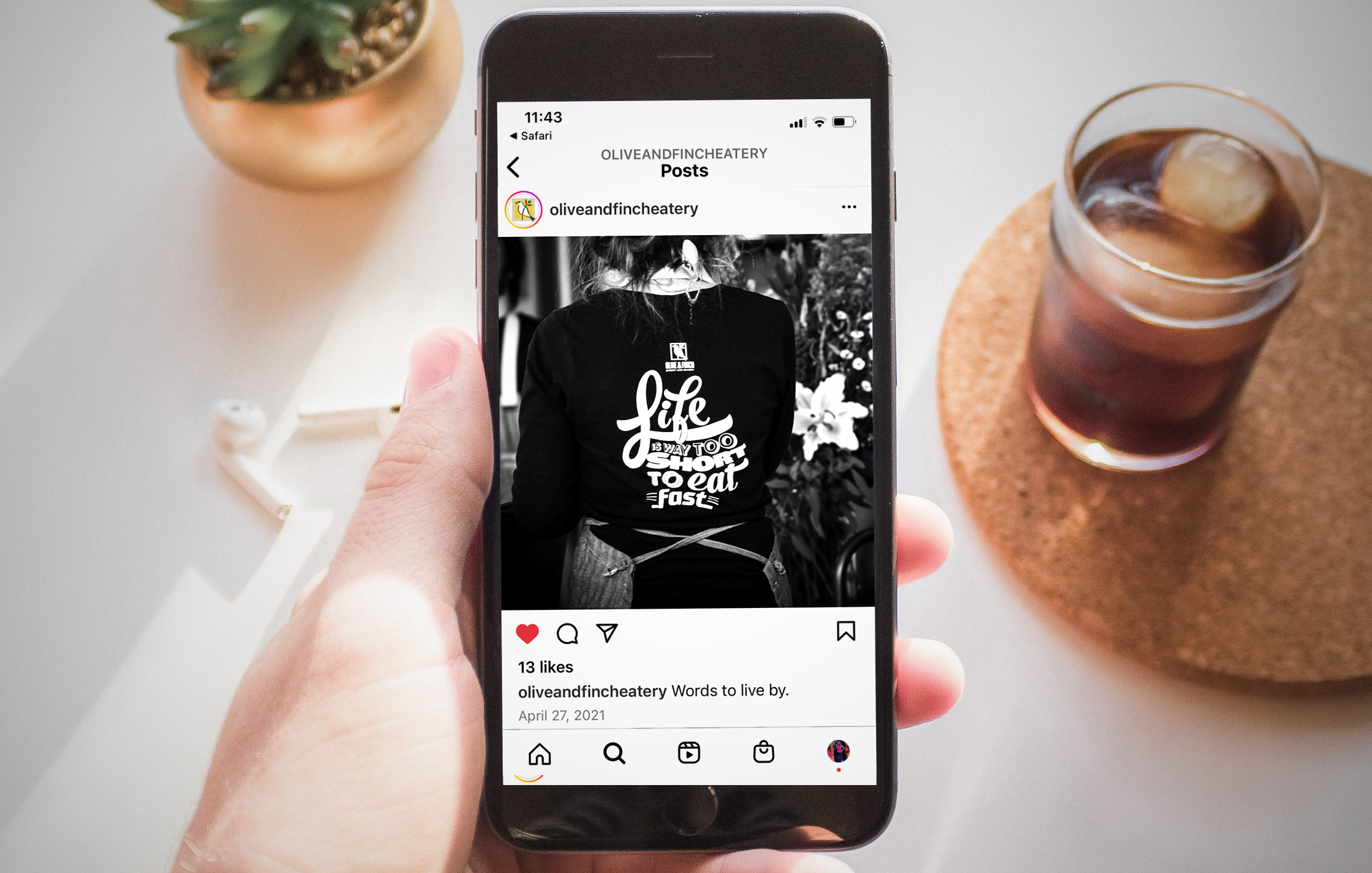
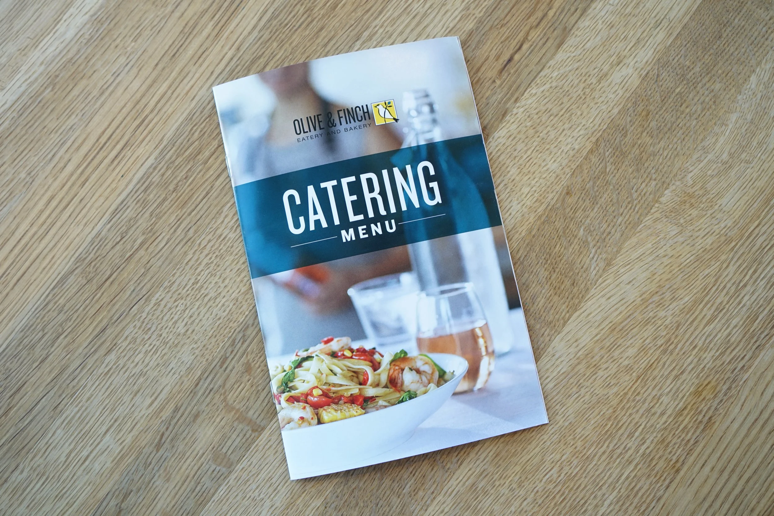
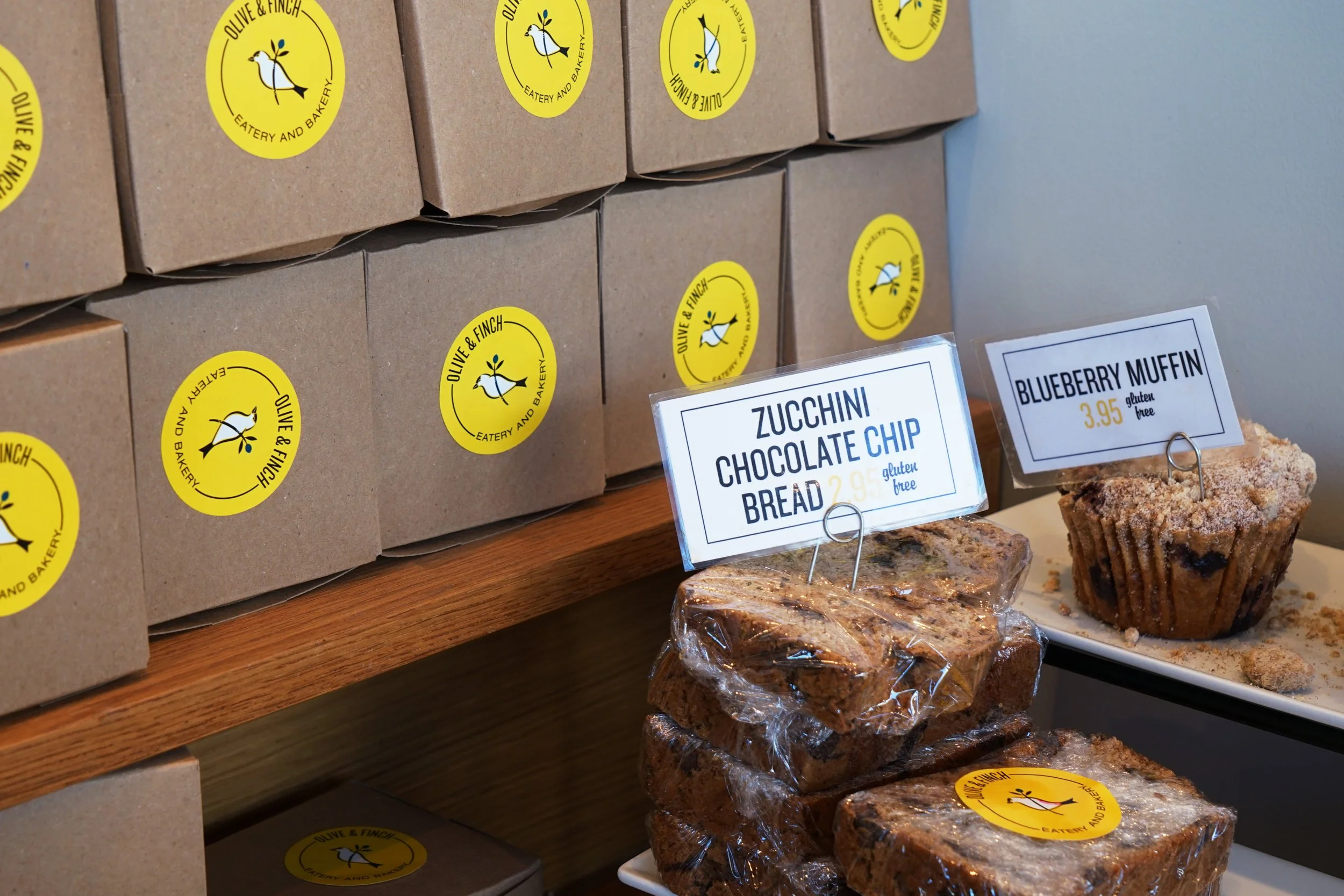
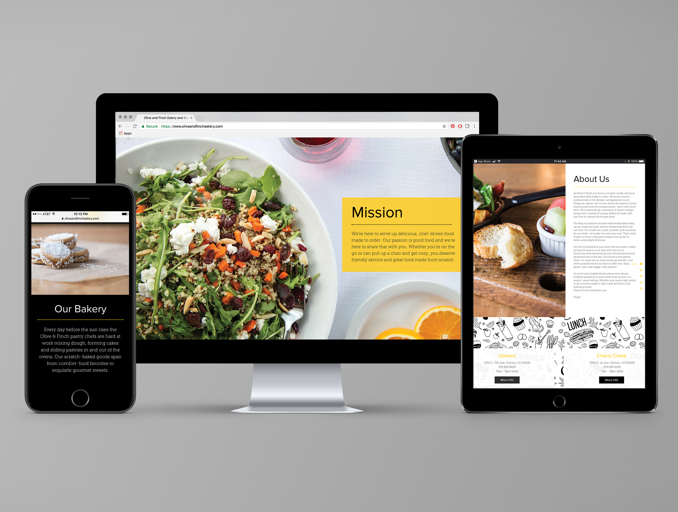
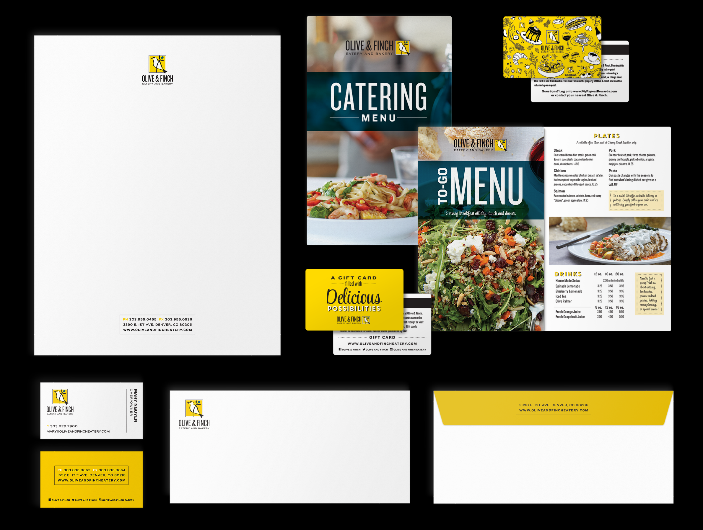
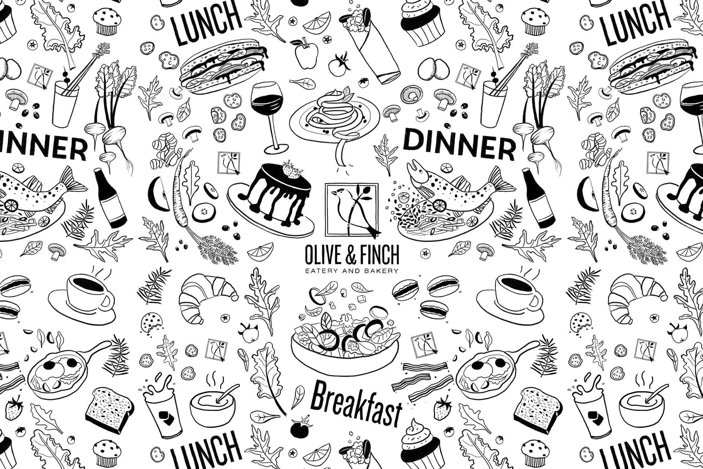
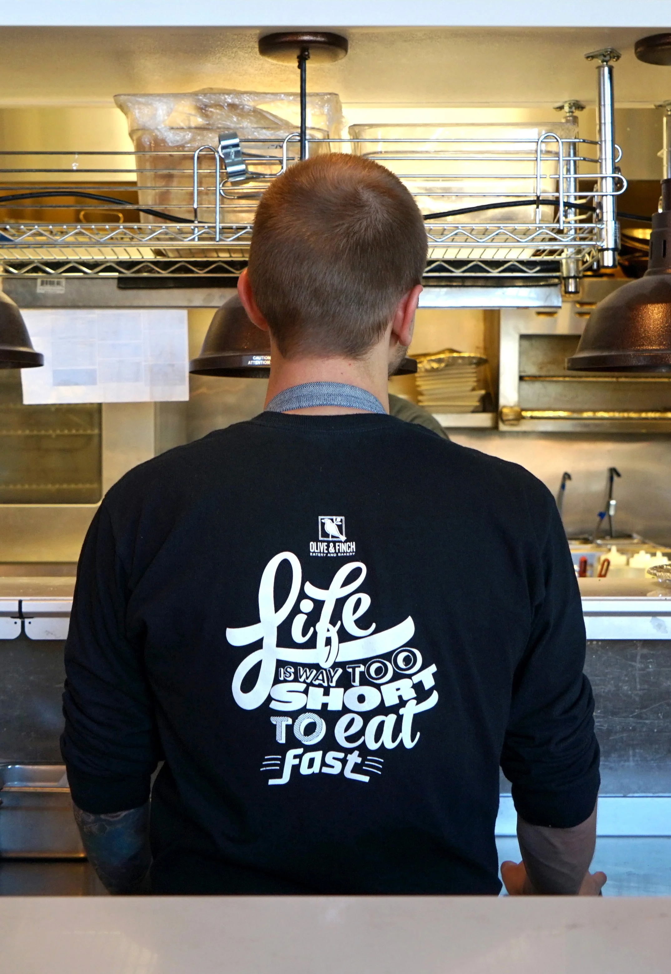
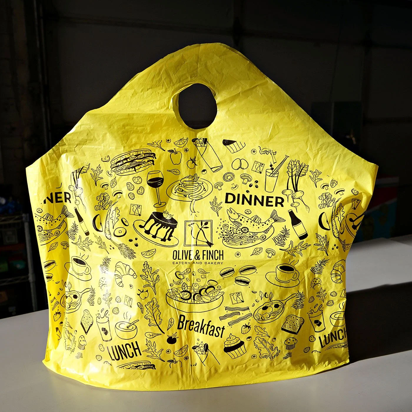
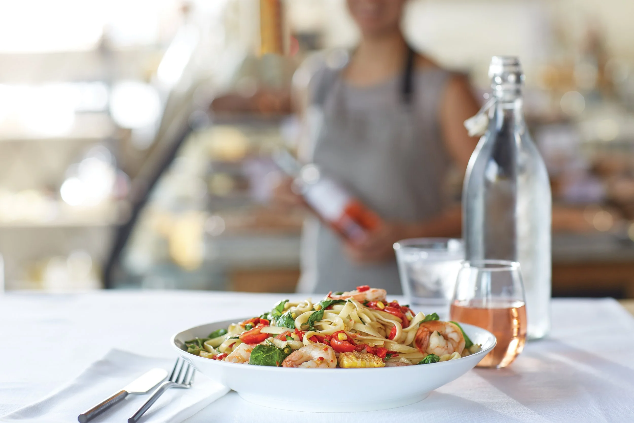
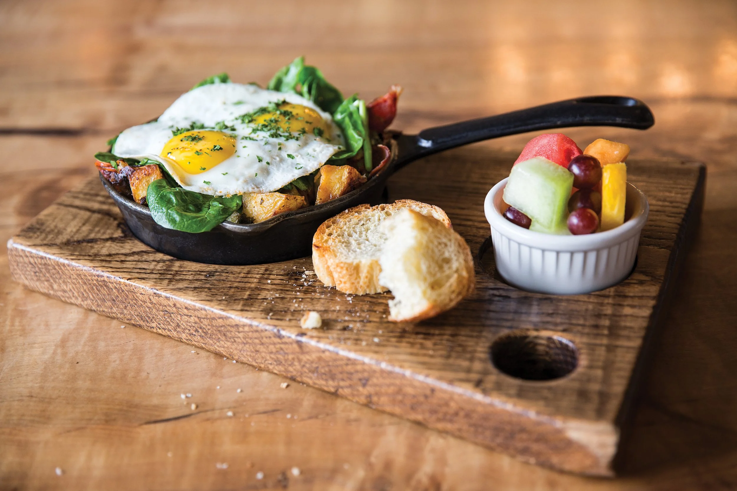
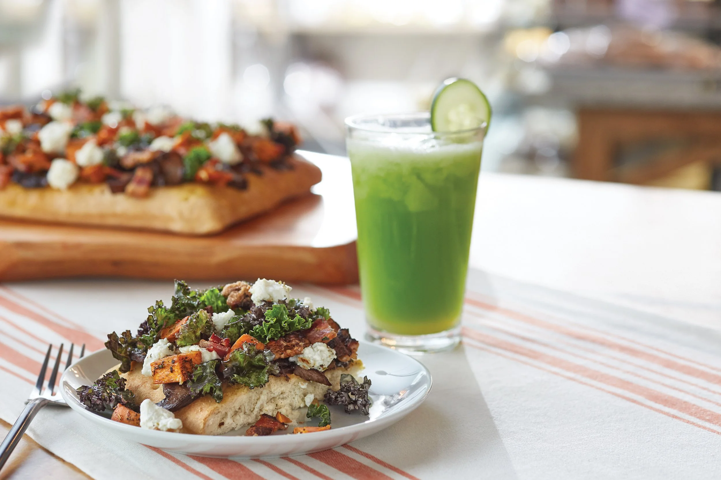
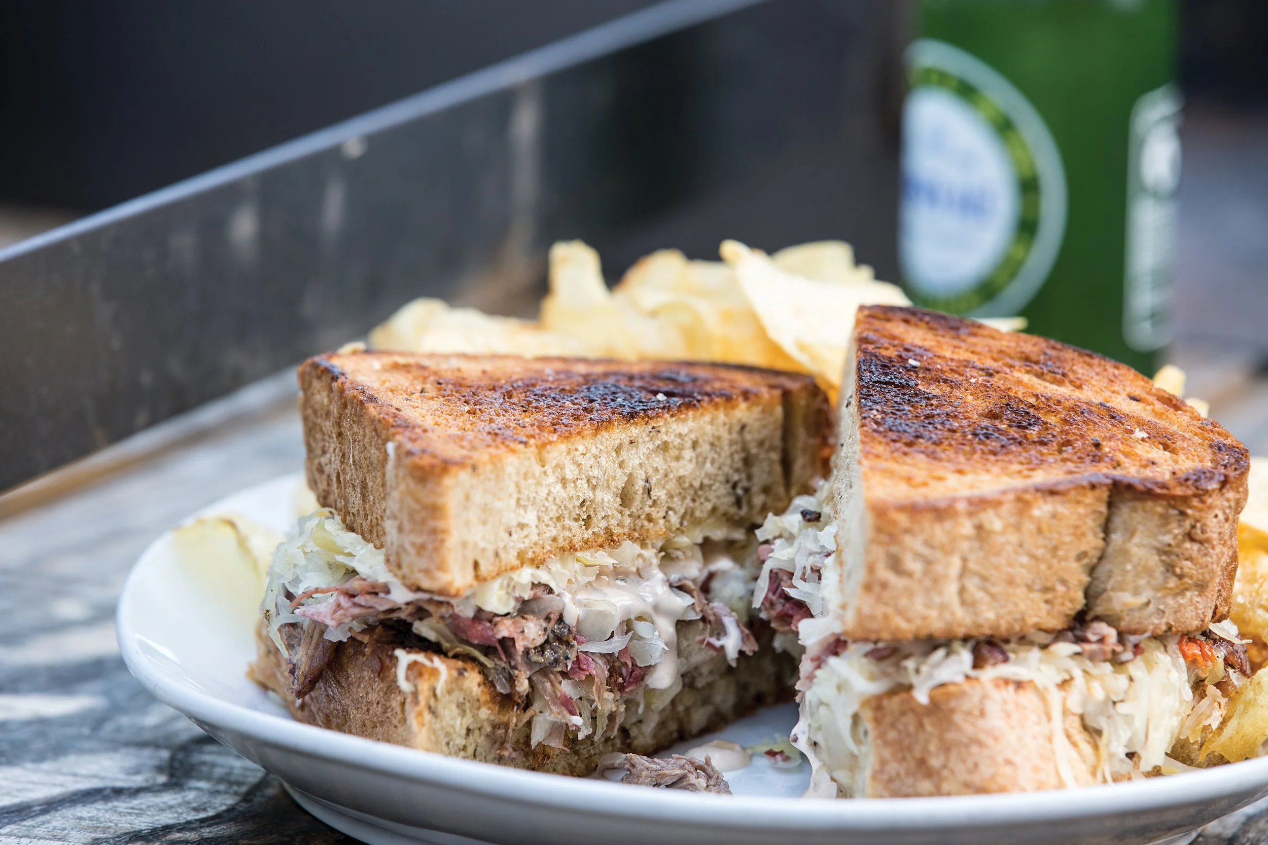
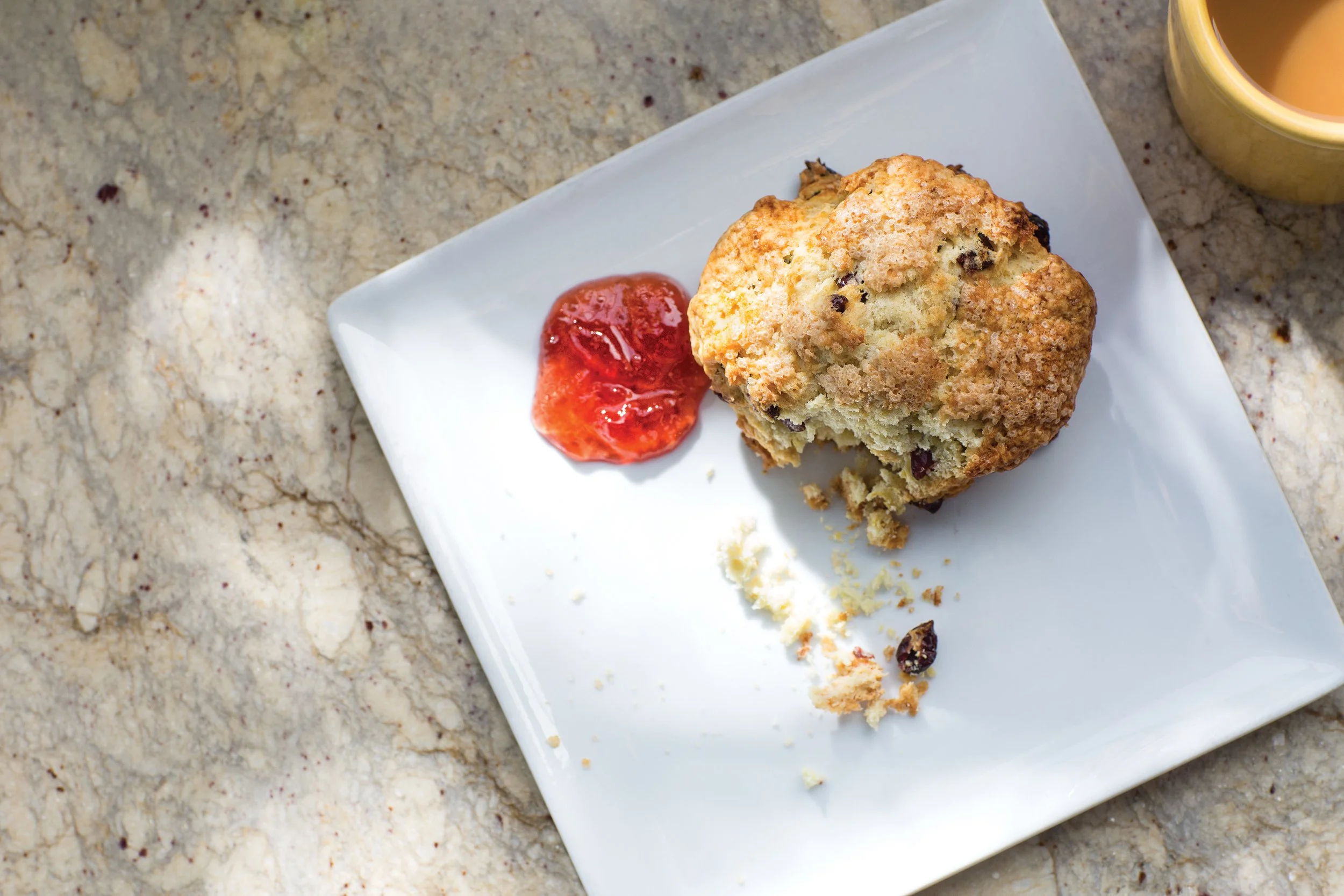
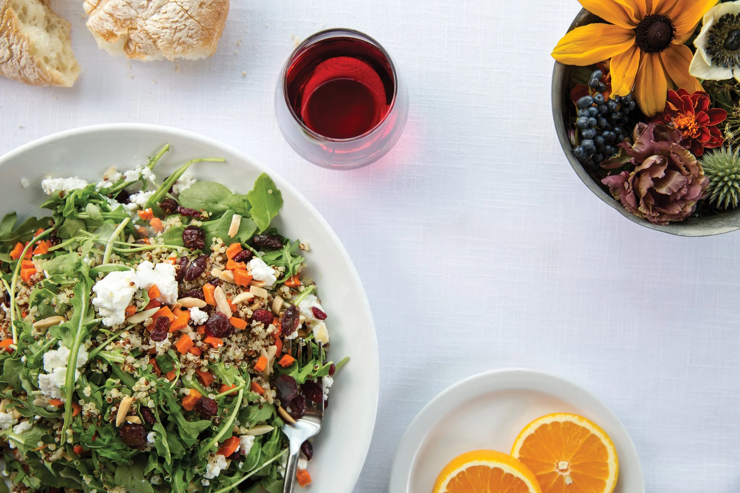
The design strategy mirrored the concept of the restaurant–it was grounded in a minimalist foundation with hand drawn elements and varied type treatments echoing the fast-casual setting with made-from scratch staples. The Finch and yellow in the logo had gained enough equity that we deemed them significant elements, so the logo only required some refinement. The photography strategy showcases the wide range of dishes in a bright, crisp light with minimal styling that includes touches of textures like wood and linen. We developed a tone of voice that is fuss free and peppered with humor. Today Olive & Finch continues to win over critics and is well positioned as a leader in the casual dining scene in Denver.
Credits
Creative Director/Art Director/Designer/Illustrator: Amanda Villalobos
Copywriters: Fernando Diaz Morlet & J. Villalobos
Photographer: Kim Cook