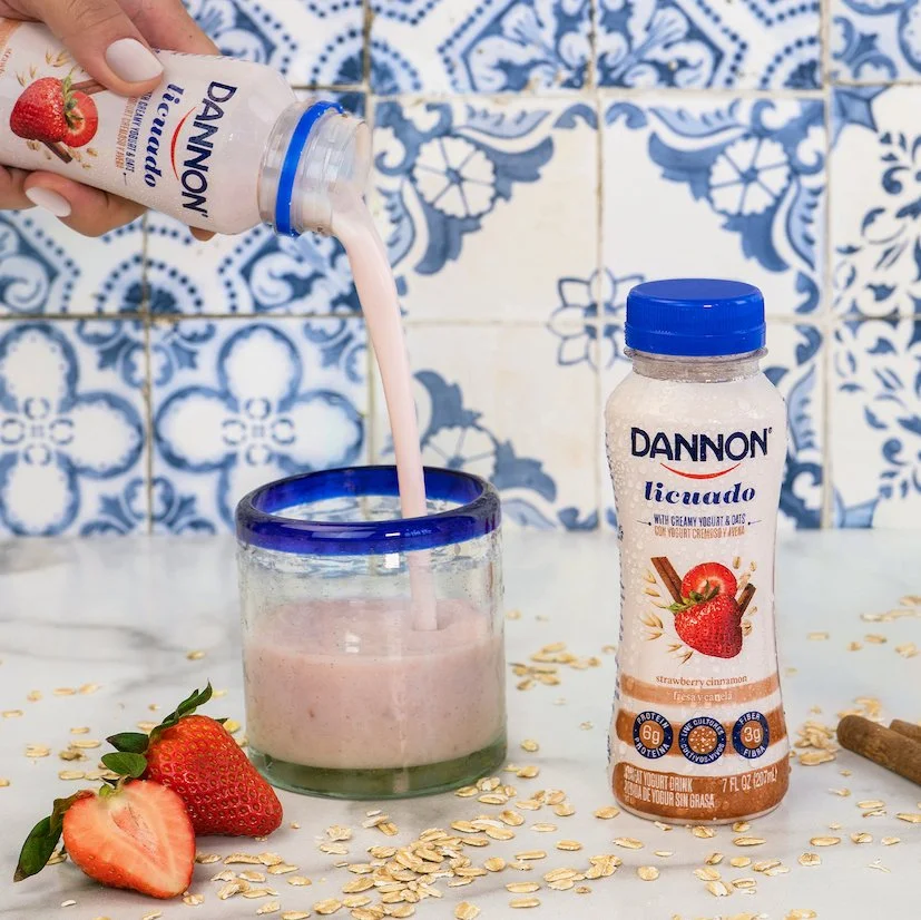
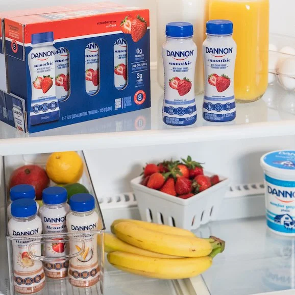
Dannon Licuados
The challenge: Design smoothie packaging for Latinos in select major U.S. that resonates with the flavors of the licuados they and/or their parents grew up drinking.
The packaging had to be bilingual and work within the current Dannon brand design system, this lead to some serious design challenges that included icons that included both languages.
My role: redesign packs, design icons, and oversee all aspects of the photoshoot and project.
The result: Three skus with a design that has remained in circulation despite a Dannon brand restage, going strong for 5+ years now.